 |
| No, that's not the cover – this is an early draft that I rejected before publication |
It came out ten years ago this autumn, and was never an officially sanctioned edition, but for some fans, the one and only edition of TV21 that I edited is now considered as ‘canon’. It’s included on DVD collections of the comic’s original run, which is gratifying... if somewhat surprising.
It all started at the kitchen table of Tim Beddows. We were kicking around ideas for items we could include in a packaged DVD release of the documentary Filmed in Supermarionation, which Network had commissioned from producer Stephen La Riviere. Tim wanted a big, deluxe packaging job, and I’d been considering some kind of limited edition model of a Thunderbird craft, but such an item would have proved prohibitively expensive. As a sort of wild idea, I threw out the notion of doing our own edition of TV21. Somewhat to my surprise, Tim immediately liked it. But if we were going to do it, I’d have to do it myself – there could be no farming it out to a publisher or other content creator.
I didn’t mind this at all. I’d been making my own editions of TV21 since the late 1960s, when a tiny reproduction of the first ever cover in that week’s edition prompted me to have a go at imagining what the actual comic might have been like. This home made endeavour does not survive, but the second edition does, and was included on the ‘Shades Page’ of the 2014 edition.
I knew from the outset that I couldn’t possibly produce a complete, 24-page TV21 comic single-handed, and aside from one or two contacts, I had little or no idea where to look to solicit contributions. In the end, I was able to contact John Freeman, who spread the word via his Downthetubes website, and I also knew David Lloyd, who put word out amongst the comic fraternity. Within a fairly short time, I was receiving emails from comic creators around the world.
One thing I was certain of was that we needed some original TV21 contributors on board. I’d previously commissioned Mike Noble to paint a cover for a DVD release of Fireball XL5, but Mike was in poor health and although I made an approach, he was sadly unable to contribute anything. I had better luck with John M. Burns, whose TV21 pages had been confined to the black and white adventure strips Catch or Kill and Front Page. While I ended up including the latter in our edition, I wanted John Burns in full colour. He agreed to produce a double page spread, on condition that the script was written by a known author. I was more than capable of writing any kind of Gerry Anderson comic strip, but John didn’t know this and my name carried no clout in the serious world of comics. For this reason, I asked John Freeman to write the script (he also wrote Agent 21 for us). His Lady Penelope story was one of only two in the whole comic that were entirely self-contained (the other being Project SWORD). I think John Freeman also wrote our Joe 90 strip, and I solicited futher contributions from comics expert Shaqui le Vesconte (Project SWORD and Captain Scarlet). The rest was down to me.
 |
| John Burns' Lady Penelope spread before the captions were added (I now own the original) |
I can see from my records that this work didn’t really get started until June 2014 – a perilously tight deadline for an October production date. As well as John Burns, our ‘originals’ line-up included Martin Asbury – not a bona fide TV21 artist, but well known for his contributions to Look-in, Countdown and many others – and Gerry Embleton. I was particularly pleased to have Gerry on the project, as his artwork had been included in one of the first books I ever owned – the Fireball XL5 annual published in 1963. He had been a semi-regular on TV21, filling in for his brother Ron during his occasional breaks from the Stingray strip, and I also knew his work from the nursery comic Robin, not to mention illustrations for various bubble gum card sets during the 60s and early 70s. Gerry was given Stingray to illustrate, from a script written by myself.
One of the concepts I came up with was to have the stories revisiting pilot episodes of the various series, although in the end this was only carried through to the Thunderbirds strip, which saw a MkII Fireflash being hijacked by the Hood. British artist Martin Baines drew and coloured this strip in his customary detailed style. I’d sort of hoped he might have restyled the Fireflash, but he drew it faithful to the original. It had to be updated somehow, so we changed its colour scheme to red. For the record, my original Captain Scarlet story, which saw an assassination attempt taking place at a rebuilt London Car-Vu, ended up as a separate comic, illustrated by Paul McCaffrey, that was produced to accompany our blu-ray release of the series.
By early June, I had enough artists signed up to set the ball rolling, and on the 5th of the month, I sent out a short briefing document. In it, I made it clear that the intention was to replicate the look and feel of the original as closely as possible, and although welcoming digital art, I specfically mentioned that we did not want 3d illustrations, and asked that the digital artists might endeavour to give their work as much of an ‘analogue’ feel as possible. I also stipulated that the artwork should not bleed off the pages, a trend in modern comics that I’ve never liked, and which would have been totally alien to the TV21 asethetic.
 |
| The Secret Service, which never appeared in TV21, was one of my favourite pages from the comic. Artwork by 'Baretti'. |
The old guard stuck with tradtion, and I received large artwork boards from Messrs. Embleton and Asbury, with John Burns’ sumptuous Lady Penelope strip arriving in a cardboard roll. This caused me some problems (and cost me a parking fine) when I needed to get it scanned, eventually using a bureau in Derby that had an oversized scanner on the premises. Also supplying original art was noted cutaway specialist Graham Bleathman who, for reasons I don’t remember, provided a painting of the Martian probe rocket and transporter from the Thunderbirds episode Day of Disaster.
I knew that all this artwork would take time to create, and in the meantime I faced the not inconsiderable task of artworking the huge reprint of Stephen La Riviere’s book that was to accompany the box set. In doing this, I had the pick of hundreds of interesting stills, many of them very rare. Having seen the book in its original form, I elected to use, as far as possible, shots that had not been seen too many times before.
Back on the comic, the first pieces of artwork were beginning to arrive. The very first to turn up was Martin Asbury’s Captain Scarlet, in black indian ink on Bristol board, for which he apologised in advance, not having had recourse to such techniques for many years. I scanned the artwork in sections and joined it all together: those scans are dated 21.07.14. Next to meet the deadline was Martin Baines, whose Thunderbirds pages are dated 30.07.14, just under two months from the original brief. John Burns’ Lady Penelope was with me by the end of August, with others continuing to trickle through during the first weeks of September. And don’t forget that looming production deadline. September 5th was the art deadline I’d specified on the brief, and in the end few of the artists actually made it. Production wise, we had a bit of leeway, as the comic wouldn’t take long to print, and in the event was the very last item of the box set to reach the printer. But what those artists all failed to realise as they overshot the deadline was that even after receipt of their pages, I still had to add all the balloons and lettering myself. In the case of Martin Asbury, I also had to add colour to his black line work, a not inconsiderable task.
Somehow, in the midst of all this, I found myself drawing a strip, something I had originally planned not to do. However, with two pages going spare, and time on my hands while I waited for more artwork to arrive, I set myself the task of drawing Zero-X in the style of TV21’s art editor Jim Watson, whose distinctive if idiosyncratic work had featured on the original strip during 1968. This endeavour earned me a friendly, telephonic lesson in comic art from John Burns when he saw the results. There was no point trying to explain that I’d been trying to do a pastiche of Watson’s work. I very nearly omitted the credit from my pages (in a kind of homage to Countdown, I’d included art credits for all the contributors). Either way, my pages were completed by 3rd September, some way ahead of the remaining ‘real’ artists.
The last to arrive was Gerry Embleton’s Stingray. He’d had an accident with a bottle of ink and had to redraw one frame (I still have the damaged original somewhere). While Burns’ Lady Penelope was dramatically coloured, and high in contrast, I felt the Stingray panels were a little anaemic by comparison. I suppose I could have corrected this in Photoshop (I did with a couple of other pages) but in the end decided to leave them unmolested. I mean, this was Gerry Embleton, after all!
 |
| Gerry Embleton's Stingray before the addition of captions. |
Gerry was soon to become the Peter Cushing to my Morecambe and Wise: on several occasions I answered telephone calls from an international number (Switzerland) to find him on the phone, politely asking when he might expect to be paid. Network’s accounts department were never exactly speedy when settling invoices, but in Gerry’s case seemed to be particularly tardy. I even suggested paying him myself and getting the company to reimburse me, but fortunately it was settled withour recourse to such action.
On the editorial side, I became Colonel White – not difficult, as I already had the right colour hair. I included a few in-jokes such as references to Mars Press and a Mysteron plot to plant false information in the pages of TV21. This was, in fact, a dig at the editorial team who had overseen the slow dismantling of the comic’s format in 1969, including a Captain Scarlet storyline that did away with the Mysterons entirely. The comic was by this time in the hands of a syndicate called Martspress, so you can probably see what I did there. Our Front Page strip (a late addition to the line-up) allowed me to develop this idea somewhat.
Design wise, I created a new masthead that was in essence a combination of the ‘Spectrum era’ TV21 and the comic’s belated return to newspaper covers in 1969. For the editorial sections, I used the same fonts that had been seen in the original TV21, with particular emphasis on two weights of a Grotesque variant that fairly screamed ‘1960s TV21’ when you put them into any page layout.
Although the comic was intended as a one-off, I allowed for the (admittedly slim) possibility of a continuation, by running all but one of the strips as the opening episodes in what could have become an ongoing continuity. In fact, many of these storylines were developed through a series of covers we included in the box set as a folding postcard. I’m not sure if many people entirely understood these additional covers, as I’ve seen some of them online purporting to be from the real run of TV21. Evidently, I'd made them too realistic!
 |
| 'Issue 249', one of a series of continuation covers I created as postcards for the box set. |
By the first week of October 2014, I finally had all the content together and a fully artworked comic ready to be sent to the printers. I’d decided to try and print on a vintage style paper, but was given bad advice by the printers: what we ended up with was plain, uncoated paper that lent a dull, matt appearance to the colours and was a bit of a disappointment when I got to see a copy. By contrast, the proof pages had been shiny and brilliant. TV21 itself was printed on a type of paper that has now completely disappeared. It was a far cry from the ubiquitous shiny stock that is used on all modern comics and which I wished to avoid, but neither was it plain uncoated pulp stock. In retrospect, I should have simply opted for a glossy paper, and would take care to use improved stock on all our other comic projects.
The final TV21 credits read as follows: p.2 Zoony the Lazoon/ Lew Stringer; p.3 Agent 21/ Brian Williamson; pp. 4-5 Stingray/ Gerry Embleton; p.6 adverts; p.7 The Secret Service/ ‘Baretti’; pp.8-9 Thunderbirds/ Martin Baines; p.10 Supercar/ Jim Hansen & Bambos Georgiou; p.11 Joe 90/ Mike Collins; pp.12-13 Lady Penelope/ John M. Burns; pp. 14-15 Project Sword (text)/ Paul McCaffrey; pp 16-17 Captain Scarlet/ Martin Asbury; p.18 cutaway, Graham Bleathman; p.19 Fireball XL5/ Mike Collins; pp.20-21 Zero-X/ Martin Cater; p. 22 Front Page/ Mark Wheatley; pp. 23-24, editorial. All in all, it was a unique and remarkable opportunity to work alongside such a stellar line-up of comic creators, and while it was definitely a one-off, there would be further comic creations from Network in the years to come.
Having proved the concept, as it were, I had no difficulty in persuading Tim to include comics in our other Supermarionation box sets. He had, after all, seen and laughed at some of my childhood creations (the Department S comic strip that I drew aged nine had to be seen to be believed). Now we had the chance to do it properly. There was a comic each for the box sets of Captain Scarlet and Joe 90, excellently artworked by Paul McCaffrey (now a 2000AD contributor), and comics to accompany the blu ray box sets of Supercar, Fireball XL5 and Stingray. For Supercar, I returned to the ‘Beakercar’ story I’d set up in the 2014 TV21, and got a whole comic out of it in what I felt was a faithful representation of the TV series. I also contributed art to this endeavour, pencilling the faces of all the characters, with the final pages inked by Bambos Georgiou. For Fireball XL5 I tried to be innovative: I’d developed a means of creating comics from photo-montage – a far cry from traditional ‘photo comics’ as it involved a considerable effort in Photoshop to combine numerous elements into the finished frames. This technique was showcased in an online comic Lightning 5, published in David Lloyd’s Aces Weekly between 2019 and 2020 (the comic itself being a visual homage to Supermarionation). I now applied the same methods to Fireball XL5, chopping up frame grabs and recombining them to produce something that looked, at a glance, like a photonovelisation of an actual episode. I deemed it a success and repeated the technique for a sumptuous Stingray comic which had originally been earmarked for long time Anderson comic artist Steve Kyte. When he had to pull out of the project, I went for the photo-montage look again, creating what I modestly believe to be the most faithful recreation of Stingray outside the TV series itself.
 |
| Joe 90: a page from Network's comic illustrated by Paul McCaffrey |
Whether fans understood what I did on those projects is something I’ve often wondered. Did they simply glance at them and dismiss them as simple photo-stories of the kind produced in various annuals over the years? Unfortunately, the box sets were produced in such limited editions that none of the comics – TV21 included – was ever seen outside of a few thousand individuals. If I got no traction, no recognition, indeed nothing back from any of them, it was hardly surprising.
What I did achieve was to add another digit to the complete run of the original TV21, which ended at issue 242. I can still remember my disappointment at what became of TV21 in September 1969, with football covers and barely any of the Gerry Anderson series left on board. Issue 243 was, in essence, me resolving my own long-standing issues with the whole later era of the comic, and I was pleased when I realised that fans were now treating it as bona fide to the extent of including it in pdf collections, while the football-focused revamp has been ignored.
There have been other Anderson comic efforts in recent years, proving that there will be interest and commercial viability in such projects for the forseeable future. At time of writing, a number of Supermarionation series are available to stream on ITVX where it is to be hoped they will be connecting with new fans as well as old.
For me, creating Gerry Anderson comics and design content was a job I dreamed about in childhood, and I consider it a privilege to have been able to make my own small contribution to the genre, not just in the form of comics, but in the often elaborate packaging that accompanied Network’s releases. Having spent a lifetime with those series, I've developed an understanding of their asethetic and a deep appreciation of the extraordinary creativity that went into them.
If TV21 No. 243 turns out to be the last hoorah of a beloved title – and it most certainly will be the last to include work from the original artists – then I'd like to think the comic went out on a positive note. It wasn't motivated by greed – we did it for the enjoyment of fans at our own cost, and never sought to capitalise on the comic by selling it outside the box set – and I think it was true to the spirit of the original. For me, it was an interesting and unique experience, squaring a circle that I'd set in motion years earlier with my own comic creations. In a school essay of many decades ago I imagined myself, at some point in the future, creating comics for a living. If nothing else, I can claim to have done it at least once...
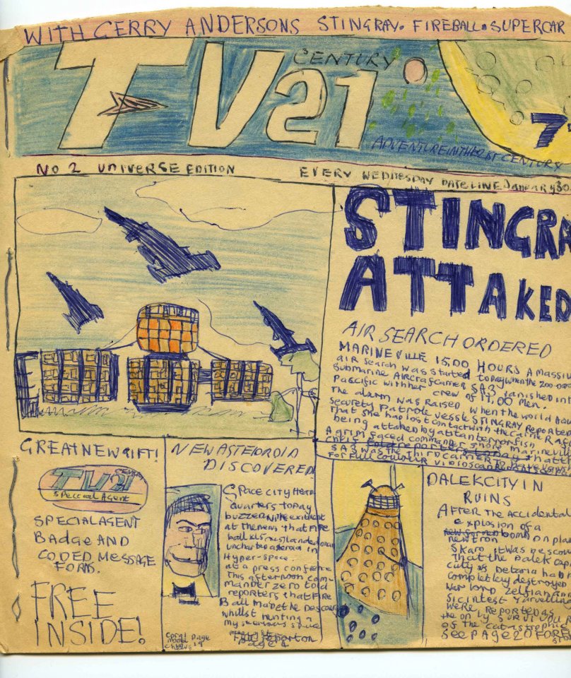 |
| Where it all started: my own take on TV21 issue 2, copied (using a magnifying glass) from a tiny reproduction in a 1969 edition. |
I know what you mean about Martin Asbury not being an original TV21 artist but didn't he draw some of the run of the football strip Forward From The Back Streets in the Martspress era?
ReplyDelete