Monday 19 September 2016

Preserving the old ways...

They were the Village Green Preservation Society – the Kinks.
 L-R: Pete Quaife, Ray Davies, Dave Davies, Mick Avory

I recently met the author of this small but informative book about the album The Kinks are The Village Green Preservation Society. The venue for this encounter was a symposium on the subject of 60s film, and, specifically, the question of where 60s pop culture belongs in the 21st century. Not surprisingly, there was a lot of love for the Kinks, and having spent more than a decade masquerading as Ray Davies in a Kinks tribute, I drew on this experience myself in considering the subject under discussion.

The band in question – Kounterfeit Kinks (look us up on facebook) – had played a mere handful of gigs when, in the autumn of 2004, we performed at a rather fusty hotel in Ashby de la Zouche. The band, playing in a small and under-patronised bar, was barely getting through to an indifferent audience, when in strolled a trio of guys who looked to be around nineteen. These three then proceeded to make more noise and show more appreciation than the rest of the audience put together, and collectively, saved what would otherwise have been a disastrous gig. Afterwards, thanking them for their appreciation, I asked how it was that guys their age were so into a band like the Kinks. The obvious answer: they’d been plundering their parents’ record collections.

We’ve all done it. My own musical education started the same way; only back in the early 60s, it was the likes of Frank Sinatra, Harry Belafonte and the Dave Brubeck Quartet that made up the bulk of my parents’ small collection of vinyl. I’d go a little further and suggest that the paucity of good new pop groups in the early 2000s (a dearth that continues to this day) is probably what sent those teenage guys trawling back through their parents’ record collections. So much for Philip Larkin’s assertion about parental influence...

Measured in terms of chart success and popular appeal, the Kinks were a spent force by the time they released the Village Green Preservation Society album. Yet this, above any of the band’s other efforts, is the title most often name-dropped by other artistes, reviewers, and cultural commentators. When it came out, in 1968, it pretty well failed to register. But its themes of preservation, memory and nostalgia, are exactly what set me to writing this blog; and I think they’re also the reason why the album has gained so much of a retrospective reputation.

I’m writing these musings for the same reasons that drove Ray Davies to compose many of the key tracks on TKATVGPS... as he says in ‘The Last of the Steam Powered Trains’: ‘I live in a museum... so that’s okay.’ (You haven’t seen my front room. It’s a shrine to old toys and vintage guitars.) Ray, of course, is delivering a more complex, duplicitous message as Andy Miller outlines in his discussion of the album. He’s having his nostalgic battenburg and eating it: delivering a caustic dismissmal of the efforts of mid-60s blues revivalists, yet doing so in an almost spot-on genre pastiche, complete with riff-references to Howlin’ Wolf’s ‘Smokestack Lightning’, itself the source DNA for the whole blues revival.

Those bands that Ray was having a dig at – Alexis Corner, Manfred Mann, Stones et al – were, in their own way, doing exactly the same thing as those three guys who saved the evening in Ashby de la Zouche: digging back into recent musical history in search of inspiration. Whatever Ray Davies’ ambivalent thoughts about blues revivalism, it’s still an aspect of preservation, although in the album’s title song, he puts this into perspective: ‘preserving the old ways from being abused/ protecting the new ways for me and for you.’ Holding onto the present whilst acknowledging the importance of the past.

What I’m getting round to here is the importance of artefacts: the old diaries, volumes of the TVTimes, comics and toys that I’ve drawn on in writing these musings are direct physical links with the past. Our parents’ record collections are a link with an even earlier time; but as long as those artefacts are available for inspection, the past will continue to live on through popular culture, and, we hope, attract new generations of enthusiasts.

At that same symposium mentioned above, I was asked how a company like Network (my employers) can continue to find a new, younger audience for some of the archive titles we release. Having considered the question, I’ve reached the conclusion that we’re already doing something significant simply by creating physical products of neglected and forgotten TV and film titles. I’m not sure what the rate of decay of a DVD might be, but I think (at least I hope) it’s a safe bet that they’ll still be around, and in a playable state, in a couple of generations from now. It’s far easier to imagine some child of the future picking up a DVD boxset in their grandparents’ bedroom than it is to imagine them scrolling through the contents of grandad’s hard drive. Even if those DVDs are, by that time, unplayable, I’d like to think that the packaging alone might be enough to spur them on to further investigation... in much the same way as I have often been tempted to investigate some otherwise unknown film, book or album simply because I liked the sleeve.

As a sleeve designer, of course, I would say that...


Wednesday 14 September 2016

Those Madeleine Moments… (part one)

This blog, if it is anything, is an attempt to nail down lost moments in time through recollections of artefacts, pop culture and ephemera, often of the most trivial and inconsequential kind. Proust had his Madeleine (essentially, a fairy cake – dipped in tea – which undoubtedly made it go horribly soggy) and we all have our own personal equivalents.

The Hitchhiker’s Guide to the Galaxy included the story of a man (Trintragula) who managed to extrapolate the whole of creation from a small piece of fairy cake, thereby creating the ‘Total Perspective Vortex’, an experience in which an individual is made aware of his or her utter insignificance in the face of the whole of creation. Proust, with his own piece of fairy cake, was trying to extrapolate the whole of his lifetime’s memory and thereby ensure his everlasting significance in the great scheme of things: an antidote, if you like, to the ‘Total Perspective Vortex’ of oblivion which lurks at the back of our consciousness. I think we can conclude that he succeeded.

For me, that single metaphorical fairy cake is always rendered even more potent when taken in combination with some other related fragment from memory dating to the same moment in time. A good example of this concerns the spring of 1968. I can even recall what the weather was like (rather mild and sunny preceding a summer of horrendous thunderstorms). The ‘trigger’ for these memories, and one of my own personal ‘Madeleines’ is the music from the television series White Horses, which was shown on BBC1 on Monday evenings commencing on March 11th, and running through to the beginning of June. Just to hear that music again is to be back in our living room, with the curtains closed against the late afternoon light. But there are other triggers from that same point in time which, when taken alongside that glorious single by Jackie, add up to an experience that’s as close to time travel as I'm ever going to get.

One such is Cilla Black’s single ‘Step Inside Love’, the opening theme to her BBC1 series Cilla, which was going out on Tuesday evenings at the same time as White Horses was playing out on Mondays. The single entered the charts on March 18th, enjoying a nine-week run, so it was pretty well impossible to escape from it at the time, and it duly became embedded in the wet cement of memory...

Ron Embleton's painting that formed a jigsaw from the backs of the Captain Scarlet bubblegum cards.
Captain Scarlet might conceivably have been doing something more exciting than holding a piece of paper, but in fairness, Embleton had already provided sufficient action for the indestructible man in his end title paintings.

That’s two ‘Madeleine moments’. Let’s go for three: Captain Scarlet bubblegum cards. Issued by Anglo confectionery Ltd, and featuring the artwork of the Embleton brothers, Ron and Gerry (Gerry’s drawings adorned the fronts while Ron’s huge painting formed a jigsaw on the backs), this series of cards was, during early 1968, available in waxy packets of bubblegum which, for some reason, we always obtained from the Tonibell ice cream van. The van tended to put in an appearance on our street early in the evening, so the associations begin to pull together: White Horses on the TV, ice cream van out in the street, packets of bubblegum (or even a ‘Tonibell Miniball’ – a hollow plastic sphere filled with ice cream that could later do service as a decidedly un-bouncy ball: I still have a couple somewhere).

The threatening sky in Embleton's painting, with its sunset shading into stormy darkness, is also potently evocative of the time, for reasons which will become apparent below.

All these items remained in my memory down the years, and, taken together have always been able to conjur up a certain feeling that seemed to be in the air at that time. It rolls on into memories of the brilliantly sunny early summer (Manfred Mann’s ‘My Name is Jack’ in the charts) and then a hideous thundery breakdown which saw one particular afternoon plunged into a grim twilight. This 1968 weather event can actually be found referenced online, as it was notably apocalyptic in some parts of the UK. (The same thing also happened in parts of the country yesterday.)

* * *

When trawling back through memories such as these, I've found the BBC’s Genome website an invaluable source of reference: an online version of the Radio Times going back to the very beginning. Although occasionally unreliable (rescheduled programmes are never included), this can prove a potent source of ‘add-on’ memories: and a glance through the weeks mentioned above revealed a programme that I’d all but forgotten. Entitled Whoosh! and starring Play School’s Rick Jones (author of, amongst others, the memorable themes from The Aeronauts and The Flipside of Dominick Hide), this was a minimalist entertainment for youngsters, broadcast at the (for the time) unusual hour of 12.25 on Saturday lunchtimes. The sheer novelty value of there being anything on television at this hour enticed me to watch, although I have to say I found the programme itself not entirely to my taste: if memory serves, the content was rather like watching three enthusiastic student teachers having fun with a dressing-up box and a few props. Play School, in effect, for a slightly older crop of viewers. Not that I’d want to diss the immensely talented Rick Jones, an amiable presenter and a sadly neglected songwriter. I can still remember a folky ballad he performed on an edition of Play School around 1970 (I was far too old for it, but it was the school holidays) although I haven’t heard it from that day to this.

Whoosh! might never have come to mind again, had I not gone trawling through the Genome listings. In my memory, that Saturday lunchtime slot belonged to another experimental outing, Zokko! from November of the same year. This time, the twenty-minute programme adopted a ‘portmanteau’ format, with a robotic pinball machine serving as the link between odd film clips (such as a rider’s-eye view of a rollercoaster ride) and a space serial, ‘Skayn’, presented rostrum-camera style in the manner of Blue Peter’s stories and serials such as Bleep and Booster.


See where a small piece of fairy cake will get you!

Sunday 11 September 2016

Annuals are Go!


Late summer and early autumn was always a time of excitement back in the 60s and 70s. Never mind the inevitable return to school in September – this was the time of year when the annuals began to appear in the shops. I always awaited their appearance with eager anticipation, perhaps for the simple fact that annuals equalled Christmas and were, as a rule, the first potential Christmas presents to appear in the shops.

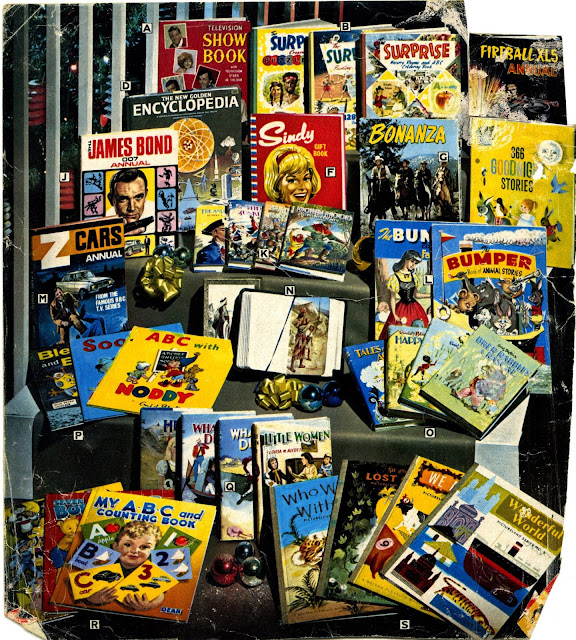
Sometimes, one was afforded a glimpse of them even sooner, via the pages of gift catalogues from Grattans, Great Universal and the like. The autumn/winter editions of these (now highly collectable) tomes generally turned up on the doorstep towards the end of the school summer holidays, and the toys section was invariably located towards the end of the book, followed by bicycles and camping gear. By chance, a page from a 1965 edition has survived down the years, through having been glued into a scrapbook later in that decade. Here, on display, was a selection of that year’s annuals alongside storybooks and a few improving classics (which were of no interest to me).


Such catalogues (or ‘club books’ as they were known in our house) would have been in preparation since the early part of the year, and it’s a safe bet that most of the annuals in this line-up are dummies. If you look closely at the Z Cars Annual, you might be able to see that the cover is a printer’s proof wrapped around the previous year’s red-covered edition in the manner of a dust jacket. The cover is evidently a studio mock-up, for although the same painting appeared on the final edition, the graphics were somewhat different, garish tones of red and yellow being substituted for the more subtle orange, white and black on show here.

Of this selection, I ended up with Fireball XL5 (though I liked the look of Z Cars and James Bond), as well as the slim Bleep and Booster book. Fireball XL5 Annual was a regular Christmas present, and always came courtesy of my grandparents, in a somewhat charming family tradition. The run of four Fireball XL5 annuals came to an end in 1966, which was coincidentally the last year that we spent in our first home, before moving on. That last edition, therefore, came to symbolise the end of an era.

Compared to what passes for children’s annuals in this day and age, these were weighty tomes indeed. Collins’ Fireball XL5 and Supercar titles came in at 96 pages each, and, with a few minor variations, followed a set format that combined limited colour pages (beginning, middle and end) with black/red spot colour and plain black printing. Colour pages were printed on a lightly coated stock, while the remainder were on heavy pulp. There were no photographs, and this tended to be the case with most annuals from the 1960s, with just a few titles managing a photographic cover such as the one seen here on Bonanza. Inside, photography, in the few editions in which it appeared, was generally limited to endpapers and title plates or, as in the case of the Dalek annuals, centre sections. Until 1966, such interior photographs were almost all reproduced in black and white.

Compare that to the slick, all-colour pages of modern annuals, which generally come packed with photographs, and it may look as if today’s kids are getting more for their money. But I’d argue that they’re getting less. The annuals of the 1960s may have been churned out by the truckload, but, in most cases, it was quality churning.

Annuals were always the poor relations of their comic counterparts, and those produced to tie-in with TV Century 21 are a good example of this trend. The big-name artists were tied to their desks (one suspects literally in some cases) turning out colour spreads, and were thus unable to contribute to the production of the annuals. Only a few of TV Century 21’s weekly contributors made it into the annuals, most notably Ron Embleton (on the covers), Jim Watson and Ron Turner. For the most part, the contents came from the pens of lesser, though occasionally interesting talents.

The first TV Century 21 Annual was somewhat of a disappointment to me when I tracked down a copy in the mid ’70s. The printing was harsh, with sour tones of blue, pink and yellow predominating, the colour being applied pre-press to black and white outline artwork. I recognised the artwork of Desmond Walduck from the same year’s Fireball XL5 Annual (which incorrectly credited him as ‘B. Walduck’), and the tight, cross-hatched work of Rab Hamilton; but none of the other artists was familiar to me.

Later years saw an improvement, and the addition of colour photographs, which added greatly to the appeal of the TV21-based annuals, as did the change to a larger format (commencing with the Thunderbirds and Lady Penelope annuals printed in 1966). The colour printing of the stories, however, remained bizarre, and seemed to have been airbrushed almost at random onto overlays corresponding to the process colours of yellow, magenta and cyan. This combined to give a smery, imprecise effect, with colours spreading across the edges of the black and white line work in a unique, but not very professional manner.

World Distributors’ titles also cut corners in the production process, opting for a similar technique, whereby areas of colour (and Ben Day dots or similar screening effects) were daubed onto overlays. In fact, of the annuals I encountered during the 1960s, the only ‘proper’ colour printing (ie. full colour artwork photographed into colour separations) was in the Fireball XL5 and TV Comic Annuals, along with a handful of nursery titles such as the sumptuously-produced Teddy Bear.

As a consumer of these artefacts, I knew which ones I preferred. Fireball XL5 was, to me, a cut above the others purely in terms of the quality of artwork on display. Eric L. Eden, a former Dan Dare alumnus, contributed most of the illustrations to the first two, and his absence was sorely felt in the later editions. Eden was, in fact, the very first comic strip artist whose work I could put a name to (although Gerry Embleton and Gerry Wood were also present in those early editions, and it was a simple process of elimination to work out who had done what). Eden, critically, signed most of his airbrushed endpapers (and one of his three covers), so it was his name that I associated with quality renderings of Fireball XL5. This was the kind of artwork I aspired to produce myself. I’d never heard of an airbrush, but what the hell? When I drew my own Fireball XL5 comics, it was Eric Eden’s artwork that I used for reference.

Looking back with a more critical eye, I can see now that Eden’s figure work was not as assured as that of his former mentor, Frank Hampson, and the pages he later produced for TV21 had a rather plain, naive look about them, with extensive airbrushing replacing his former penchant for detailed cross-hatching (as evidenced in the early Fireball XL5 and Supercar annuals). But back in the mid 60s, I had found my first comic strip hero. Were it not for his involvement with Dan Dare, Eden might have been utterly overlooked by collectors, but even so, his work remains criminally under-appreciated outside of the Dare fraternity. He died young, not particularly wealthy, and in relative obscurity, some of his last comic efforts being Dan Dare strips for a couple of 1970s Eagle annuals.

Annuals remained a Christmas (and occasionally autumn) tradition for me right through to the late 70s, with The New Avengers and The Sweeney being amongst the last I acquired. By this time, a new name had appeared on the scene, Brown Watson, whose publications showed a marked improvement in quality over what we’d been getting from World Distributors and City Magazines.

Just a few days ago, with this blog entry already in progress, I happened to find myself in the former ‘mecca’ of Annual production – Norwich. I’d always noticed the ‘Jarrold and Sons’ printing credit on the title plates of Stingray, TV21 and others, and wandering through the narrow city streets, I came upon a department store of the same name. Surely there must be a connection with the company that had printed so many annuals? A quick Google search revealed that it was indeed the same company, or a division thereof. Jarrold and Sons was, in fact, founded as far back as 1770, in Woodbridge, Suffolk, moving to Norwich in 1823. Although the publishing division was later sold on, Jarrold remains a thriving independent retailer, with its department store and other specialist shops (including a very nice art shop) still an important part of Norwich city centre. In these days of corporate takeovers, and ruthless individuals asset-stripping well-loved high street names for personal gain, it’s nice to see an independent retailer with such a long history continuing to do well. The annuals may have ended, but this year’s crop are still on sale in the book department of their Norwich department store: two traditions going side by side into the future.