

Christmas wouldn't be Christmas without the Radio Times. At least that's what this year's advertising campaign tells us. Well, I beg to differ. With the double issue now weighing in at a budget-busting five quid, I've decided to do without it, breaking a tradition that goes back almost as far as this gallery of covers. To mark this unauspicious and Scrooge-like decision, I've found this run of festive RT covers which I present here for your seasonal entertainment, complete with a sometimes caustic commentary...
The double issue was already an established tradition when I had sight of my first example, second from left on the top line, way back in 1970. I'm rather glad we didn't get it in 1969 as the cover is pretty awful and not specially festive either. The collage looks like someone was trying to re-create a Victorian postcard, or possibly Monty Python. Either way, I think we can agree it was a dud. This was the first year of the RT's classic swash caps masthead, which seems to have been influenced by the fad for Edwardiana in the late 1960s. It certainly wasn't typical of the era, and I have to confess that I never really liked it. One got used to it over time, but would have preferred something more like the RT mastheads of the 1960s. I'm still amazed at how long it lasted.
1970's festive spread felt far more in keeping with Christmas. I can't quite make out who all the dinner guests are, but I think Morecambe and Wise might be among them. The Two Ronnies nabbed the cover for 1971, which was the first year of their enduring TV comedy partnership. As if to ensure fair play, Morecambe and Wise got the gig in 1972, and all four were present for 1973's line-up. I don't care for that 1972 cover, though. Who says that circuses equal Christmas? There's not a bit of snow, holly or even a bauble in evidence. Frank Spencer made the cover in 1974, but the design was austere to say the least. That's the 1970s for you...


1975 saw a return to illustrated covers – back in the 20s and 30s, there had been some fine artworks gracing the Christmas numbers of RT, and the mid-70s would keep up this tradition. 1975's cover could easily have come from several decades earlier, and was a fine festive composition, albeit with rather low-key colour values. 1976's stained glass effort depicting Good King Wenceslas has the look of a Royal Mail Christmas stamp issue, while 1977's design, again in muted colours, pulled off a neat visual trick. Just when readers were getting acclimatised to artworked covers, 1978 was a throwback to earlier in the decade, with the year's biggest Christmas star – Mike Yarwood – getting pride of place. His Christmas Day show was now one of the big draws on BBC1, and would continue until 1981 when he moved to ITV. Artwork covers were back for 1979 although once again the colour values look decidedly muted when set against more recent examples. 1980's cover was even worse in this respect. The flat colour just looks drab, and the children look more bored than excited. Couldn't the artist have added Santa and his reindeer in the sky? As it is, they appear to be looking out at a the glow from a distant nuclear detonation. But it was 1980 after all, and the Third World War was just around the corner. Or so we imagined...


Artwork covers would rule the roost for the next four years, with 1981 again looking like a Christmas stamp contender: a nice, restrained festive image, happily ignoring all the season's visual clichés. 1982 was probably a step too far in that direction. Yes, we get the 'I Saw Three Ships' motif, assuming that was the artist's intent, but a galleon, even in festive trappings doesn't exactly scream out 'It's Christmaas' in a Noddy Holder stylee... 1983 was back to postage stamp land, with a design incorporating the twelve days of Christmas. The kind of thing you might see sold as a Christmas card in a National Trust shop. 1984's pariedolia cover is just scary. Who is that face meant to be? Santa, the Green Man or the spirit of Christmas past? Either way, I hate it. Back then, I'm not sure I even saw the face when viewed at full size. But in all honesty, I was less interested in what the Radio Times chose to put on the cover than in the programme listings. Photographs were back for the next two years, suggesting that the Christmas cover images were decided on the basis of which programme had scored the highest ratings the year before. The Only Fools cover could have been from a decade earlier, but the saturated orange background overwhelms the characters and isn't exactly festive. The EastEnders cover is just boring. Who wanted to look at the Albert Square crowd for a fortnight over the festive season? Having them on the TV was bad enough. The cover designer seems to have realised that the photograph simply wasn't Christmassy enough, and has added a festive border, the only nice touch on what is arguably the dullest cover here.


1987 was another Victoriana throwback, a cloying sickly design and one of my least favourites. Festive yes, but not in a good way. 1988's panto artwork was fine, and the lack of distracting text admirable. The kind of cover you didn't mind having on your festive coffee table. 1989's choirboy cover was a rare example of RT drawing attention to the true meaning of Christmas and was a welcome change from Del Boy, EastEnders et al. It just didn't make for a very interesting cover. 1990, by contrast was as cloyingly traditional as it gets. Nice artwork, but horrible image. Santa looks decidedly like his famous Coca-Cola incarnation. For the first time ever, the cover depicts what the Christmas RT was all about – watching the telly. And if Santa hadn't already eaten all the pies, he was certainly about to. I wonder who won the seventy grand? 1991's cover set the tone for almost all subsequent Christmas RTs. A lot of text there, and bigging up the fact that you could now get all channel listings in a single publication. The artwork was traditional to a fault, and one of the most unimaginative Christmas covers RT had served up to date. It's also self-congratulatory in a most un-Reithian fashion. Who cared if RT was magazine of the year? And who knew Santa needed specs? 1992's snowman wasn't much better, but at least the amount of text had been reduced. This would be the first year of the cover flagging up the staggering amount of movies available over the festive season – more than 500. But there was worse to come...


If there has to be a wooden spoon for the least popular Christmas RT cover of all time, 1993's effort wins it by a mile. Mick Brownfield's artwork played on the song 'All I Want for Christmas', but despite being nicely executed, it wasn't what RT readers wanted on the cover of their double issue. I detect the heavy hand of editorial influence here. Next year's cover played safe by revisiting a classic illustration from the 1930s. One notable change this year is the modification of the 'classic' swash caps masthead, which would endure for only six more years. The movie count is now up to 700. That's more than any video recorder could cope with.
1995's cover was just horrible. Yes, I know, it was Christmas, and Santa Claus is all part of the festive iconic mix, but it's hard to imagine a more yucky rendition of him. Movies now seem to be the magazine's raison d'etre, judging from the clapperboard motif. And what's that I spy? Snow-lined lettering... a publisher's cliché that RT had admirably resisted until now. It hadn't thawed by the time of 1996's snowman – acceptable but lacking in imagination – while 1997's stylised Santa at least had the virtue of minimal text. Where would it have gone, anyway? In his beard? No logo snow this year, either, but it was back in 1998, by which time the the movie count had doubled from its original 1992 quota. I don't care much for this cover, either. Santa riding his reindeer like a cowboy across a snow-covered prairie? Nah.
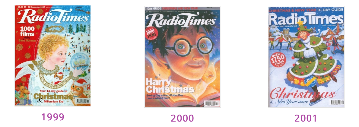

Those films just kept on coming... 1750 of them in 2001, 2000 the following year. Artwork continued to dominate the covers. Naive in 99 (hated it), un-festive Harry Potter in 2000 (hated it again), contrived in 2001, and as many festive trappings as you could imagine over the next three years. Was there a rule in the art department that the Christmas covers had to feature a blue background? Taken together like this, their paucity of imagination is quite striking. And we've also seen the last of the swash caps RT logo that had dominated the cover since 1969. 2001's sans font was just boring, but it was probably easier for snow to settle on sans serifs. This boring look dominated the next four years.


The sans title block evidently wasn't popular, and was gone by 2005's Tardis snowglobe cover, replaced with a heavy, condensed font. It still wasn't much to look at, but it made for a bolder cover design. The Dr. Who imagery reflected the show's much anticipated return to the screen that year. In 2006 you even got a 'free Doctor Who CD' whatever that might have been. And it was actually inside, rather than a mail-away offer. I have no recollection of seeing this, so must conclude that 2006 was a year in which I chose to go without the festive RT. At £1.99, the price was rather more than we'd been paying back in the 1980s, but seems like a bargain compared to the five quid they want for 2023's edition. Santa's snow angel of 2007 reflects a trend that must have gone viral around this time – we certainly didn't do it in the 1960s or 70s – and it was back to photographs with Wallace and Gromit in 2008. A welcome change from cheesy paintings of Santa, but don't outstay your welcome, guys. 2009 saw a return visit for that Coca-Cola Santa, and the first in a regrettable trend of offering alternative covers. If this wasn't taking advantage of collectors, I don't know what was...


Originality was nowhere to be seen in 2010 when Wallace and Gromit again nabbed the Christmas cover: the only characters since Morecambe and Wise and the Two Ronnies to make it onto the cover twice. 2011's alternate covers looked like charity Christmas cards. At least the blue background was gone, but one wonders what was the point. At least we were spared sickly Santas. It's hard to argue with the next two years' Raymond Briggs covers, but I've never been a fan of Judith Kerr's art, and felt her 2014 cover was playing too much to the younger members of the gallery. One regrettable trend to emerge from this run of covers is the self congratulatory puff 'The Legendary Double Issue.' Traditional, I'll grant you, but magazine covers have never been the stuff of legends. Get a grip, editior!


2021 set a corpulent Briggsian Santa against a backdrop of chimneys, and that traditional dark blue sky. By now, the amount of snow on the logo had reached excessive proportions. It's about time someone swept it all off. 2022 meanwhile, was another throwback cover. Surely that's 2011 again? It was certainly hard to tell them apart. Fortunately, you didn't have to, unless you were a time traveller. This year we have Mog, star of the by now obligatory heart-warming Christmas cartoon. Is there room on the broom for any more? Evidently yes. Merry Christmas from your resident designer Scrooge.

Larger copies of these scans, along with the covers spanning the years 1936-1968 can be found here:
No comments:
Post a Comment